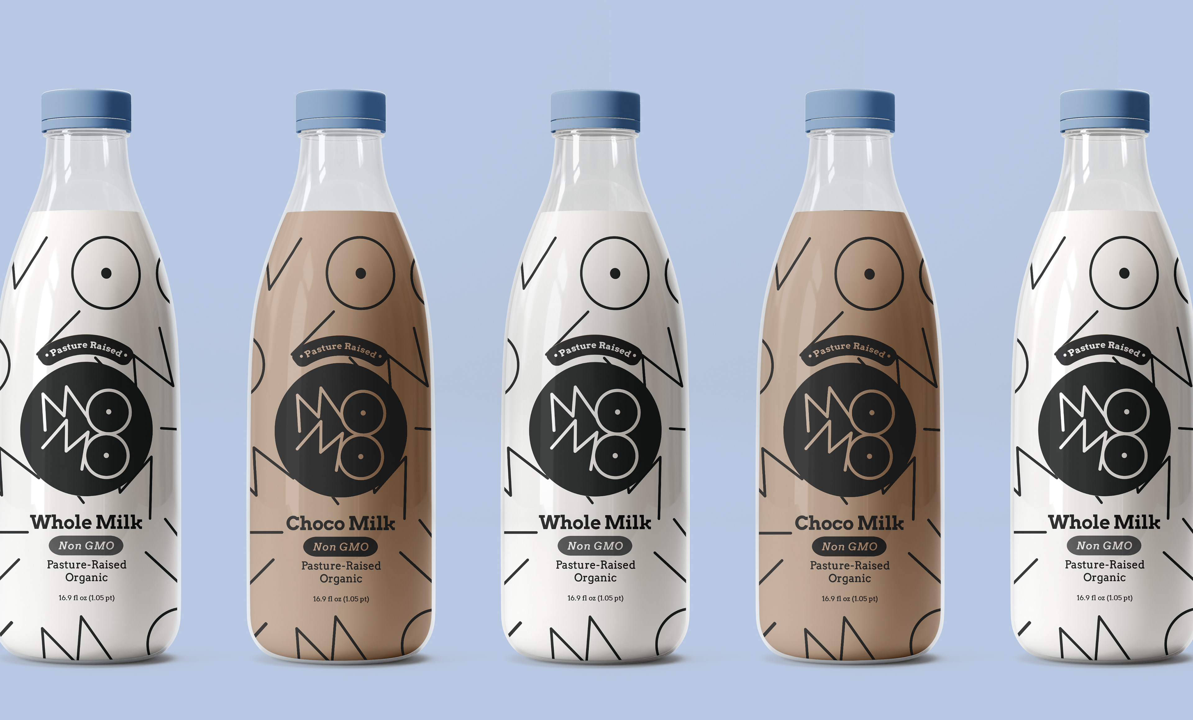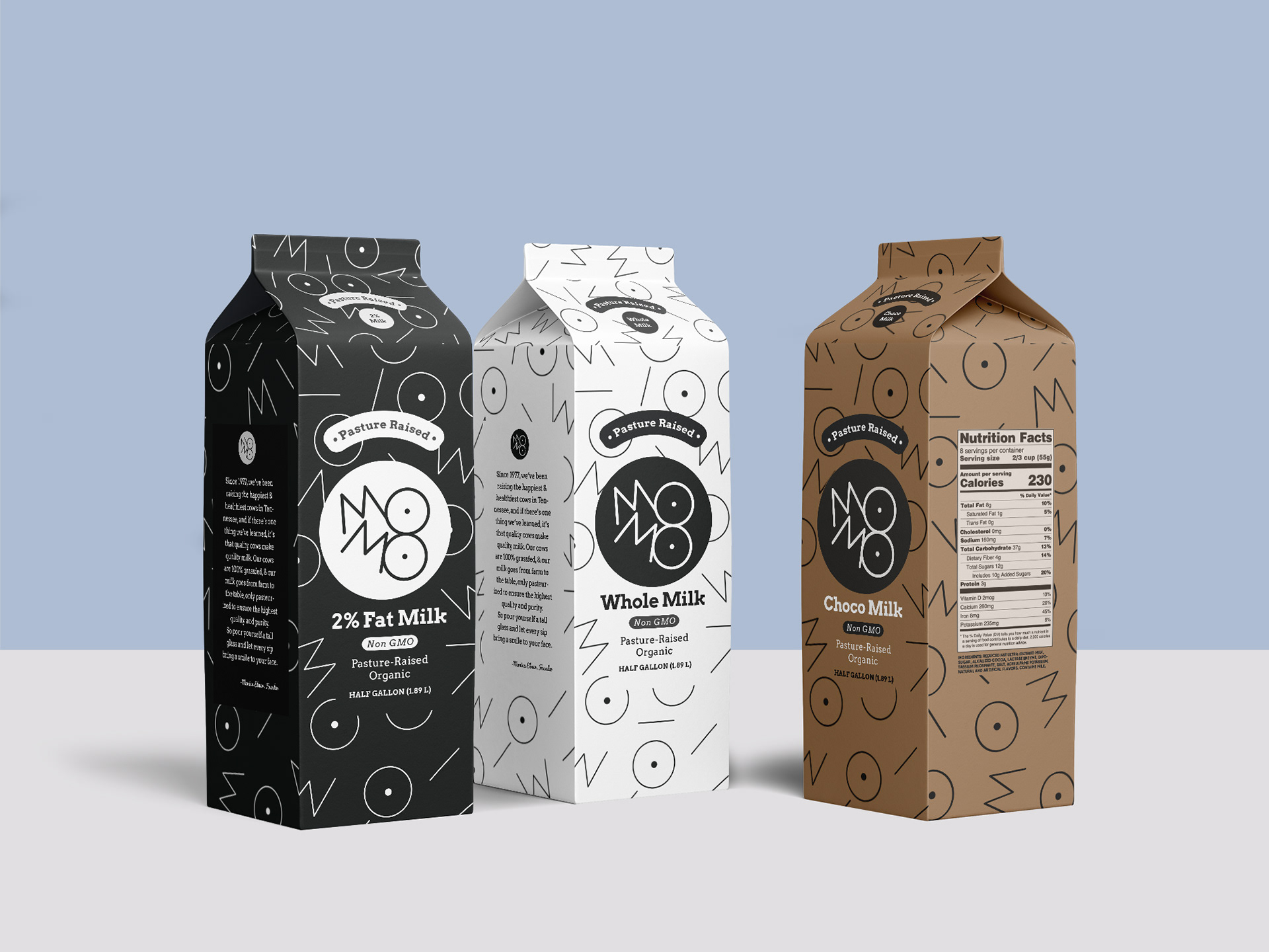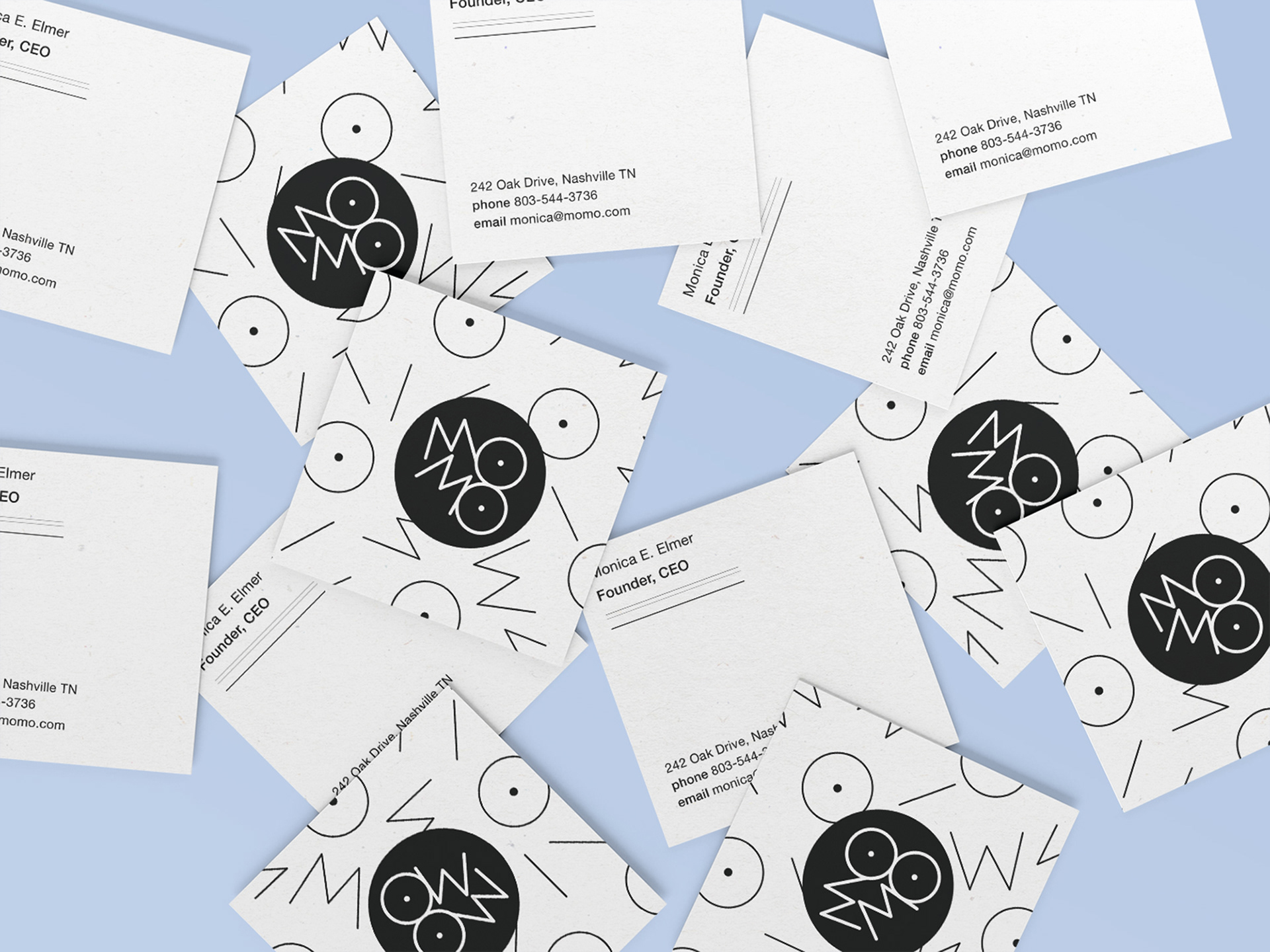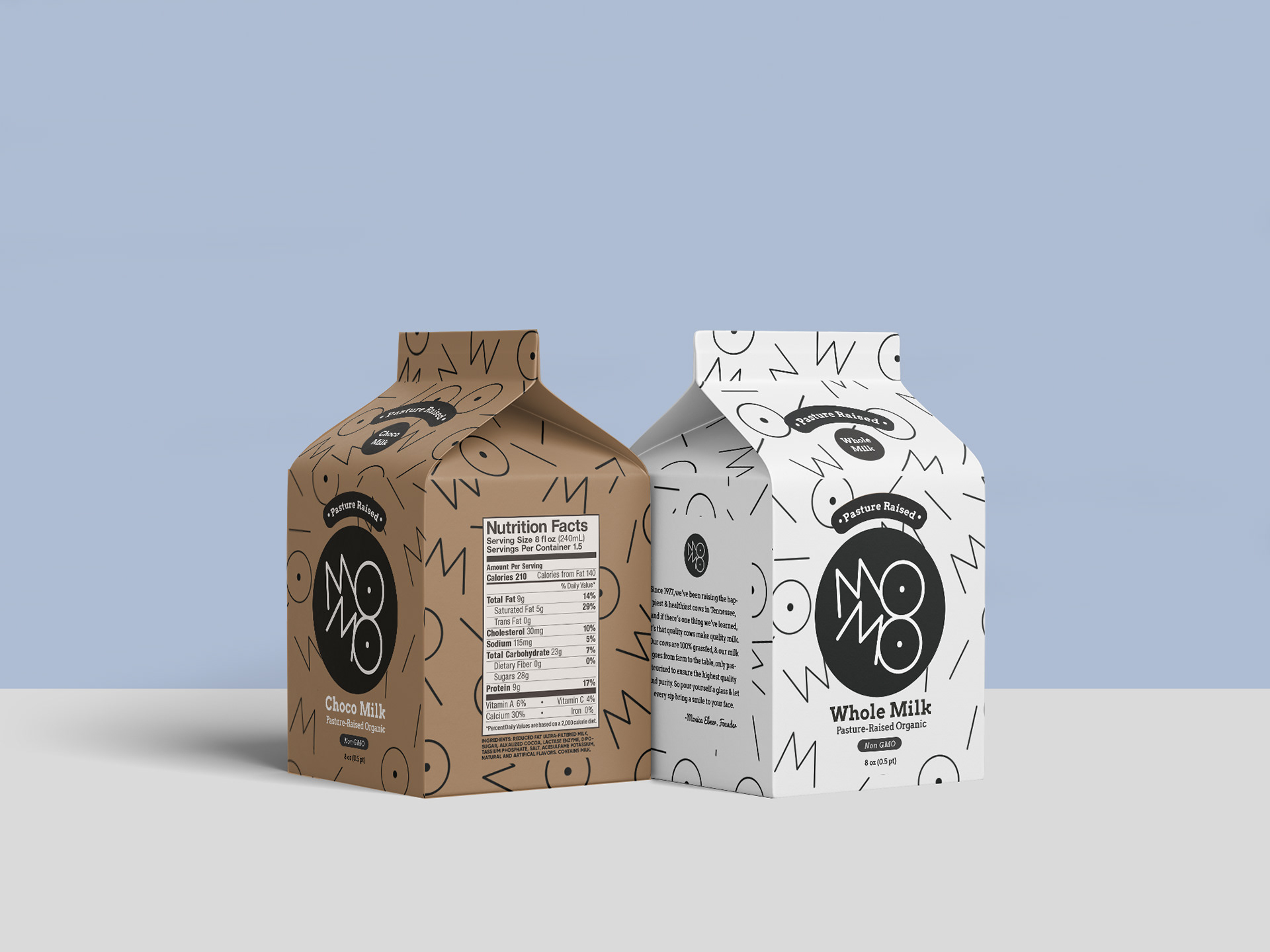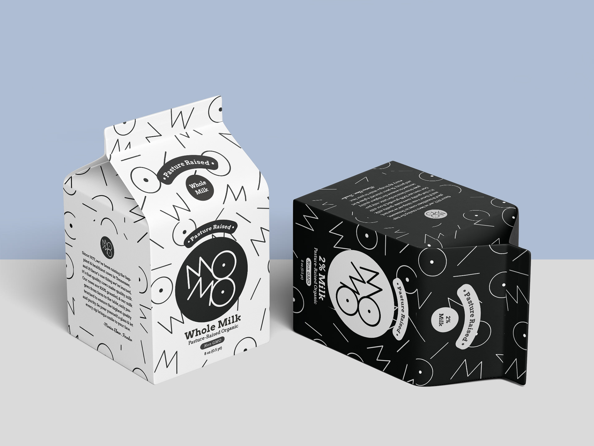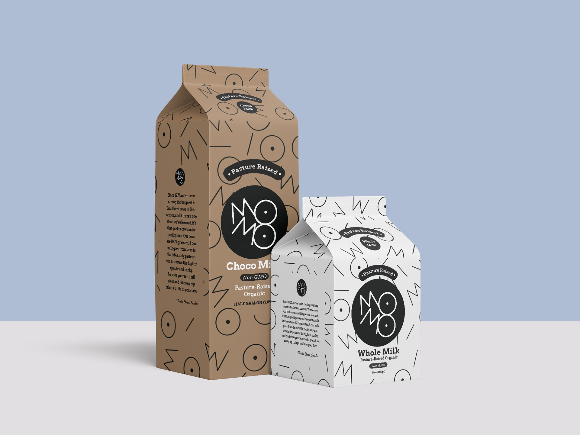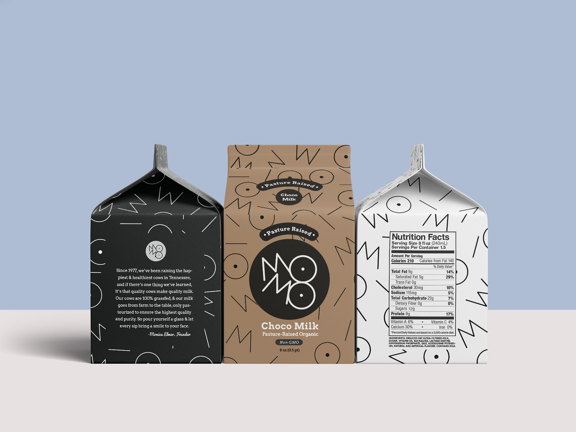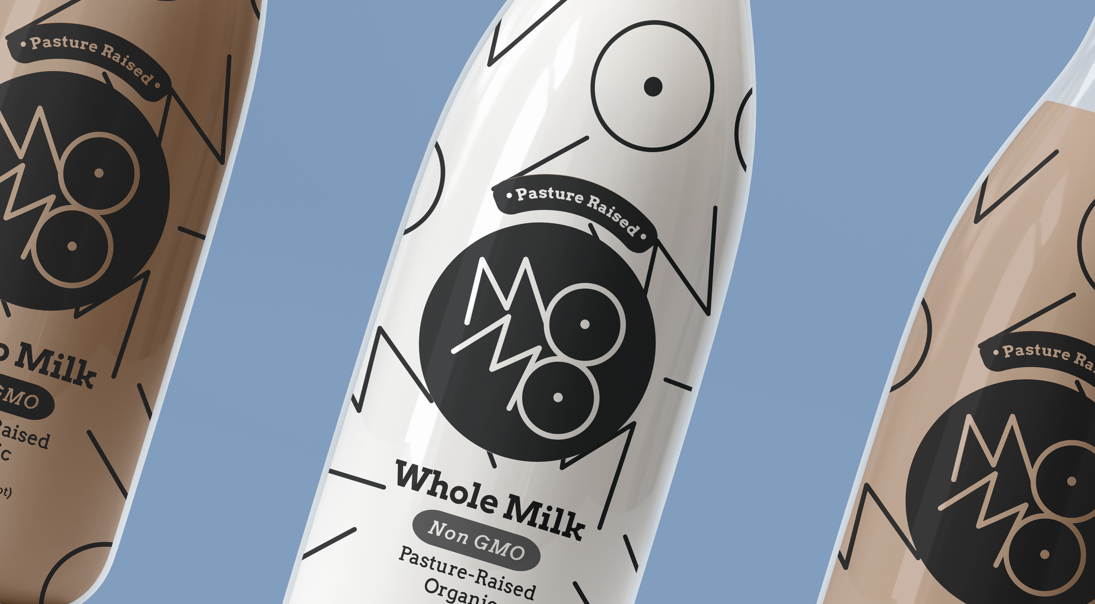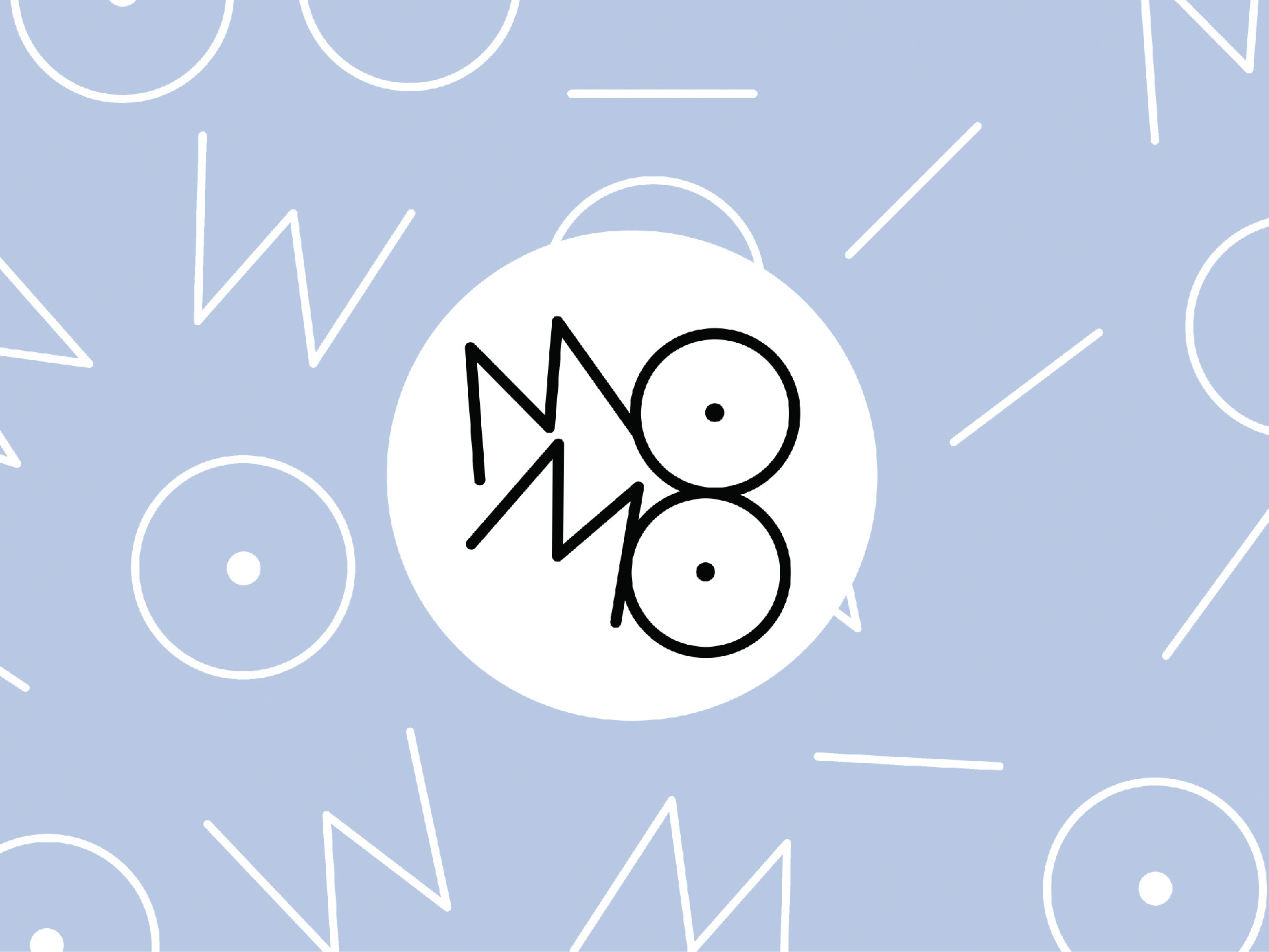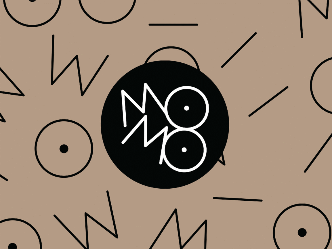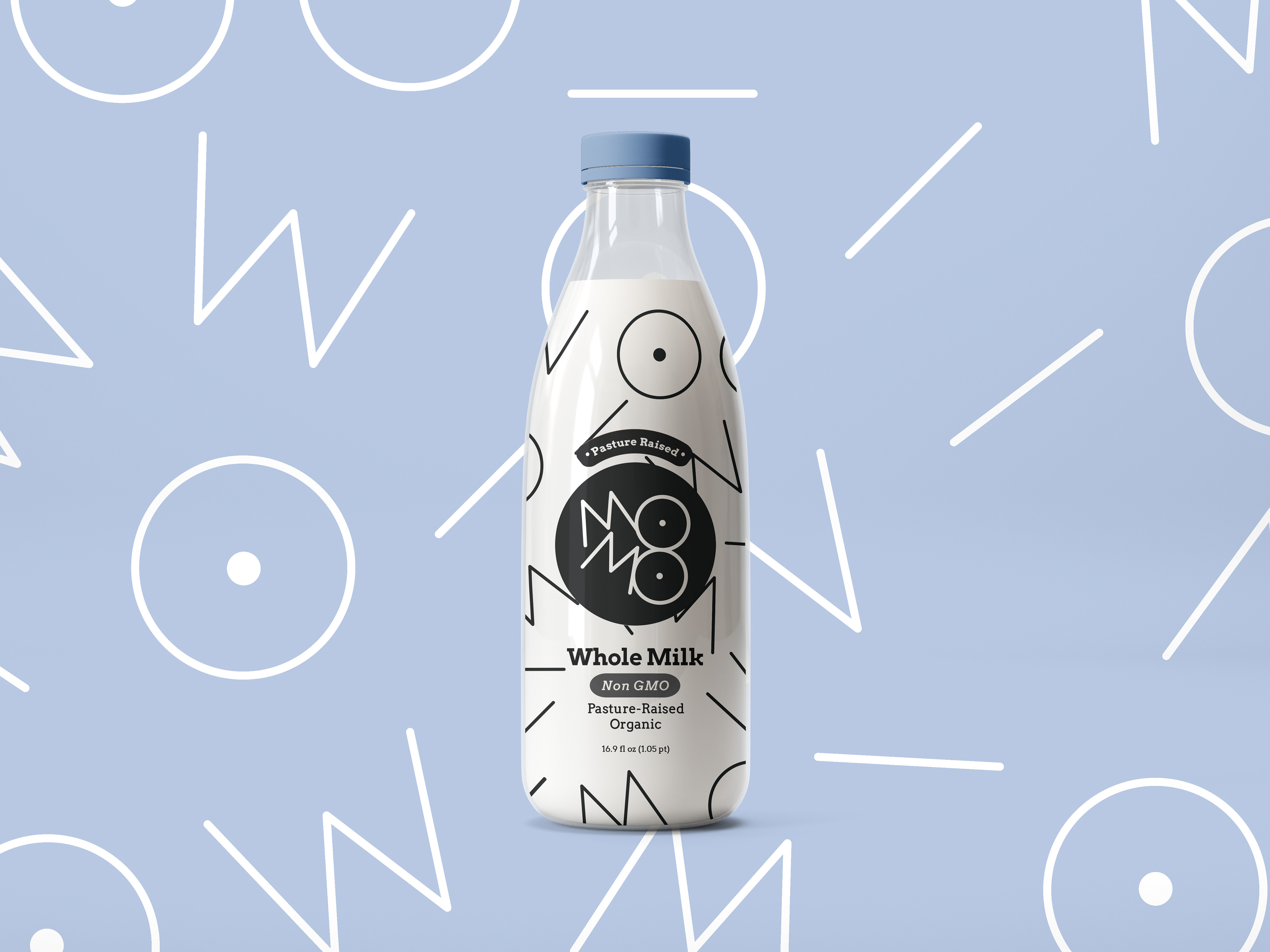

Milk is an essential product for many people, and thus a great opportunity to introduce great design into our everyday lives. For MOMO Milk, we designed two O's that are a cheeky play on udders. We then used the elements of the logo and created a fun and playful pattern for the packaging, creating a milk product that's not only essential but also fun to buy.